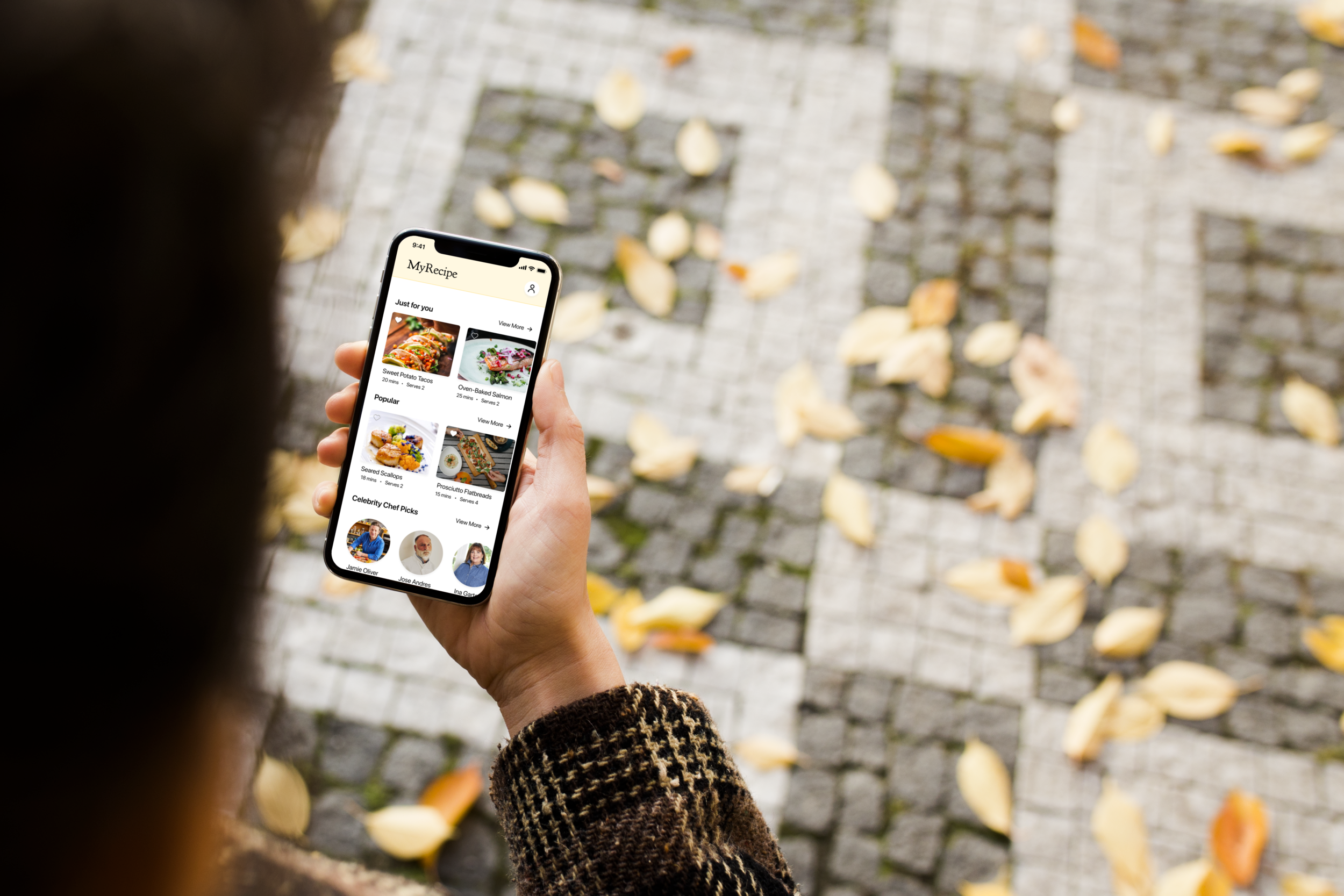
MyRecipe
Mobile App Design
The Challenge
Design a solution to give users an easier way to discover, search, customize, and cook recipes.
The Role
UX Designer
(Competitive Analysis, User Interviews, Card Sorting/IA, Low-Fi and Hi-Fi Wireframing, Color & Typography, Prototyping, Usability Testing)
The Teammates
Lauren Padula (UX Designer)
Faustina Quach (UX Designer)
The Platform
Native Mobile App
The Tools
Figma, Miro, Asana, KardSort, Google Suite
The Timeframe
3-Week Sprint
The Summary & The Goal - Why Build this App?
Great question! Our team’s reason in designing this app is that there are many recipe apps out there today, but they all have the same fatal flaw — they’re not user friendly! This is very much a passion project, as each member of our team loves to find and cook new recipes, but are frustrated with the current user experience of online recipes.
We felt the way home cooks interact with recipes needed an update. To do so, we looked to design a solution to improve the experience of cooking at home by making it easier and more enjoyable to find, share, and follow a recipe.
Discovery
Competitor Analysis
To kick off our research, we took a look at many different recipe apps and truthfully, they’re all imperfect. But we were able to gather some great design patterns from each that we could incorporate into our designs
Some features on the MyRecipe app influenced by analyzing other recipe apps
Step-by-step progress bar
Recipe customization process
In-app timer
It was a bit out of left field, but I wanted to look at Spotify as well due to its reputation as the go-to platform for music discovery and playlist creation. I thought those elements would translate perfectly into a recipe app.
We ended up gaining inspiration from the discover and search screens as well as the playlist function of the app to create curated recipes, a guided search, and “playlists” of recipes that users can share with others.
Here is a more detailed view of how we notated some Spotify features that served as inspiration for the recipe app:
User Interviews
The team had our own assumptions and frustrations with online recipes, but we needed to learn more from others’ experiences before we could start designing a solution. To identify our potential users needs and frustrations, we had to speak with them!
We spoke to 5 potential users, all of whom use recipes often.
These folks gave us a lot of food for thought, but their feedback could be summed up by a few main takeaways:
The need for a simplified process of finding recipes
Every user expressed frustration with having to scroll through an entire blogpost in order to get to the recipe
The need for a simplified process of reading through recipes
Users want to reduce scrolling involved while going through a recipe, especially when they have dirty hands while cooking
The desire to be able to alter recipes based on ingredients they have on-hand or the number of people they’re cooking for
The goal of keeping family recipes safely in one place and easily shared with one another because they often get lost
A sample of our affinity map
User Persona
With the needs, goals, and frustrations of our users put together, we needed to sum it all up to understand who we were designing for. That’s where our persona, Charlotte, came in.
User Flow
We knew Charlotte is looking to get straight to the point in finding, customizing, and cooking a recipe. Who can blame her? She’s hungry!
We set out to make Charlotte’s happy path from recipe discovery to food-on-the-table as seamless as possible. No blogposts in the way, no breaking out the calculator to reformulate recipes, no unnecessary scrolling.
Information Architecture
In the interest of allowing users like Charlotte to find and cook a meal more efficiently, we also wanted to reduce clutter on the screen, and have user find what they need exactly where they would be looking for it.
An open card sort on 5 participants revealed 4 topline items. We combined the results of this card sort with Charlotte’s requirements to create 4 global navigation items.
Home/Discover
This is where users expected to find curated lists of recipes for them to explore
Search
Users expected to find more especific search items here, such as searching by ingredient or meal type
My Recipes
This is where users would look to find recipes they’ve saved and shared, as well as a place where they can upload new recipes
Profile
This is the place users would expect to find account information, such as notification settings
Design Phase
After synthesizing all of our research, our team conducted a design studio to start sketching out solutions to each of the main problem areas we unconvered.
Soon sketches…
Became low-fi wireframes…
And we were able to usability test the first iteration of our app.
Low-Fi Usability Testing
After a round of usability testing on our initial frames, we found some issues that needed fixing. There were several more, but these are the three major iterations in our hi-fi wireframes:
High-Fidelity Wireframes
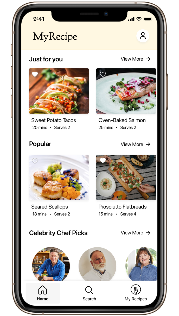
Home Screen/Discover Screen
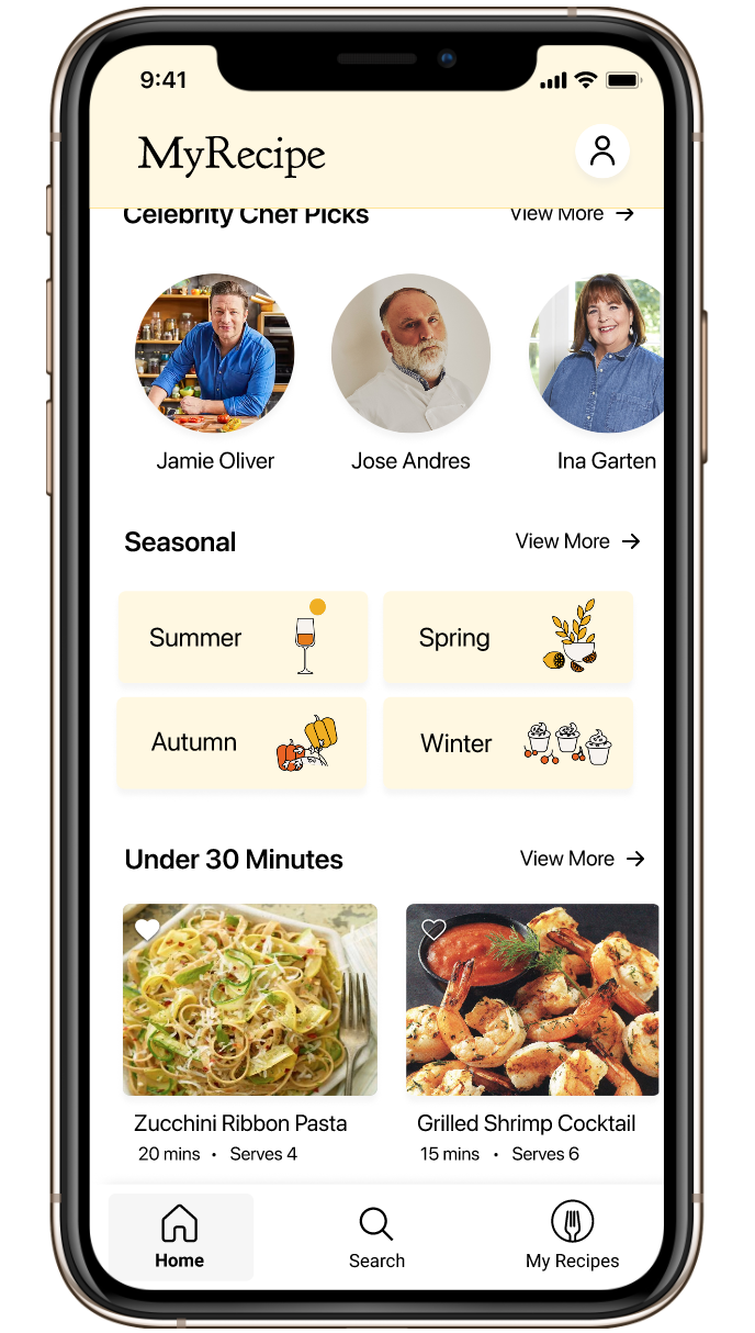
Home Screen/Discover Screen. scrolled
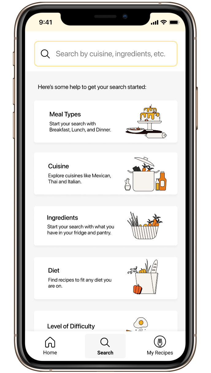
Search Screen
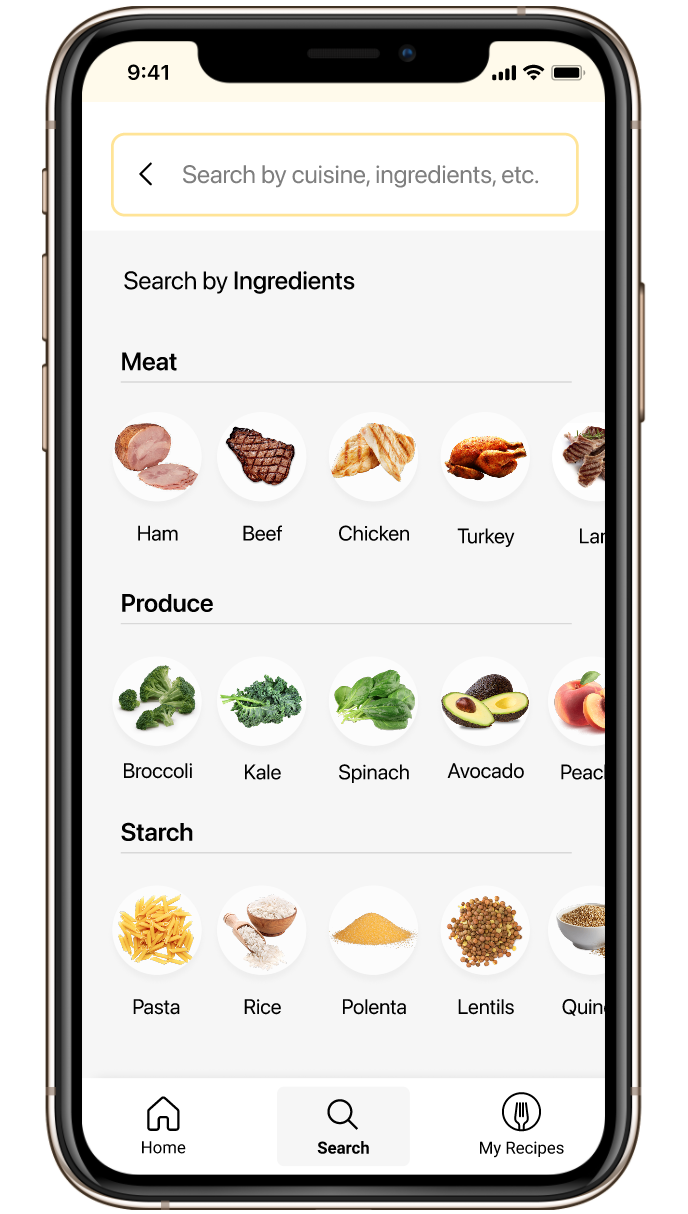
Search by Recipe Screen

Search by Cuisine Screen

Mexican Cuisine Results Screen

Chicken Fajitas Overview Screen

List of ingredients with checkboxes
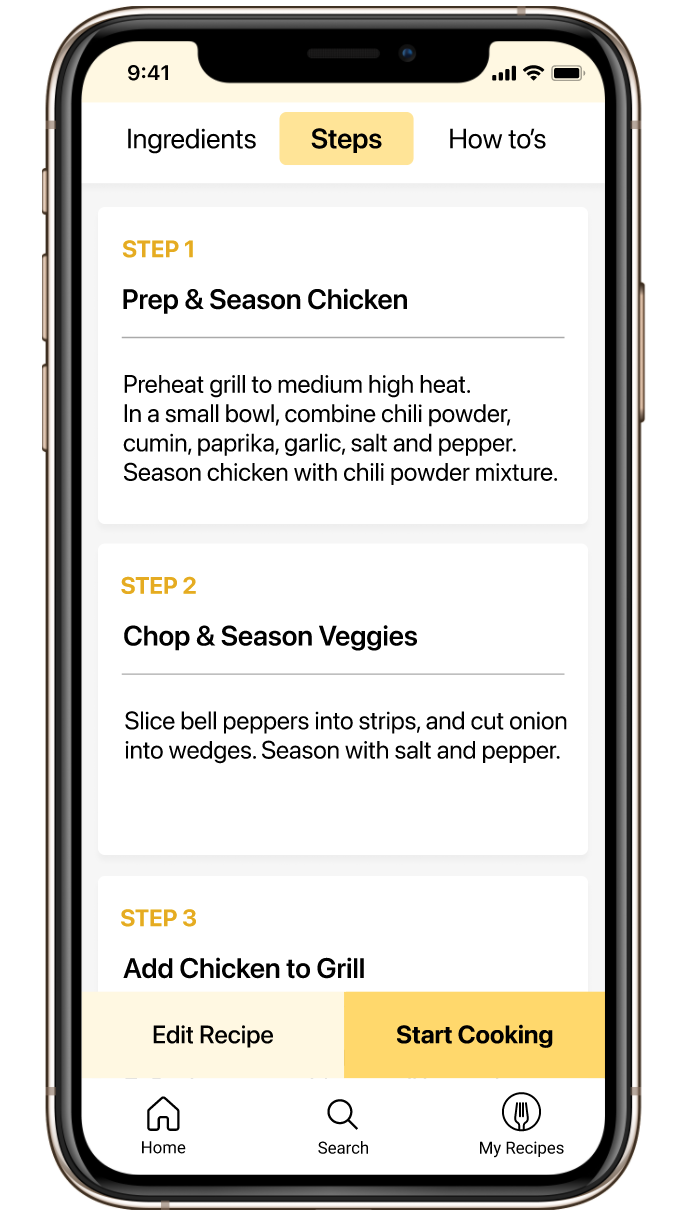
List of recipe steps

Edit Recipe Screen
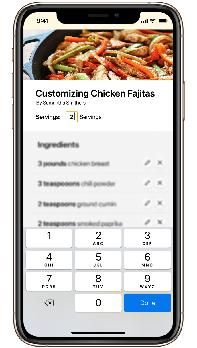
Changing recipe serving size

Measurements automatically adjust after changing serving size
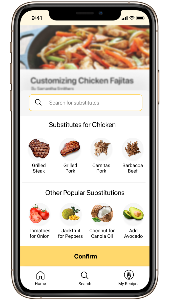
Swap Ingredients Screen
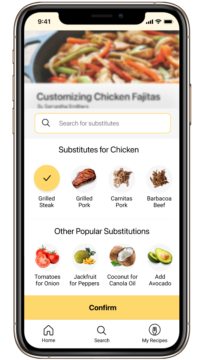
Swap Ingredients Screen, cont'd
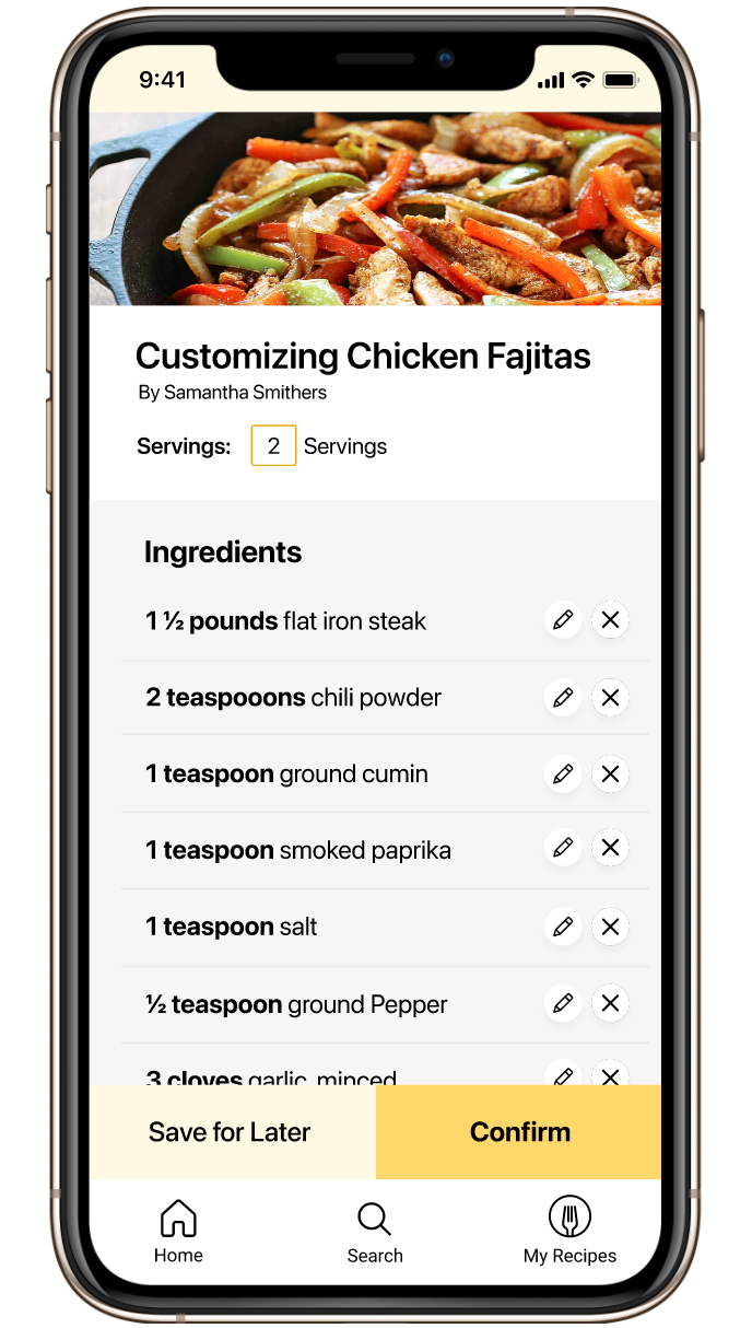
Recipe Changes Confirmation Screen
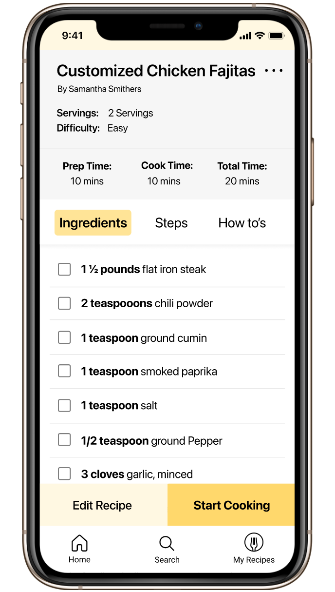
Recipe Overview Screen with altered serving size & ingredients
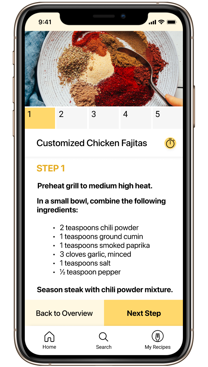
Step 1 of cooking flow
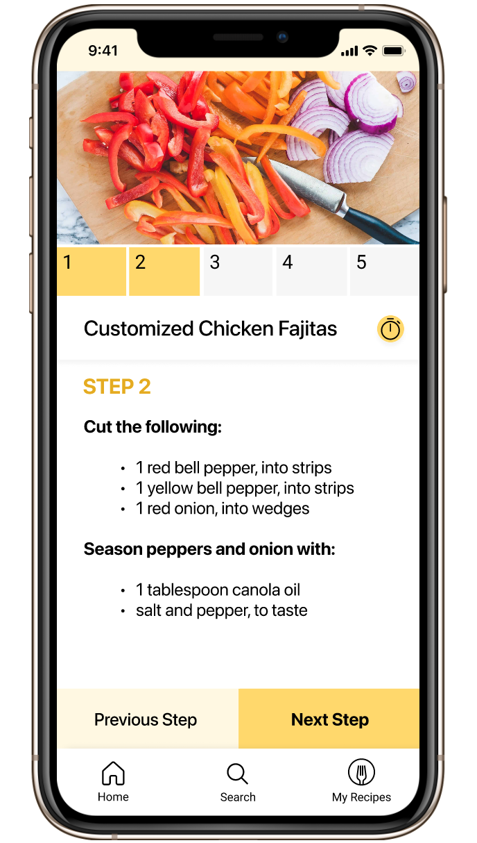
Step 2 of cooking flow
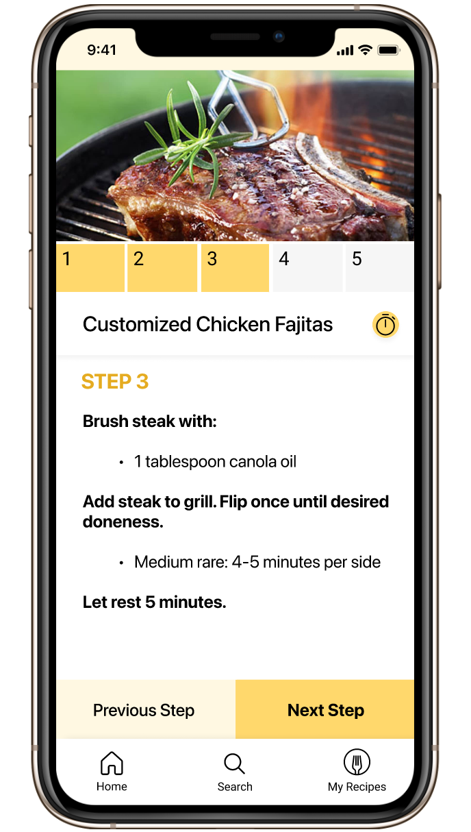
Step 3 of cooking flow
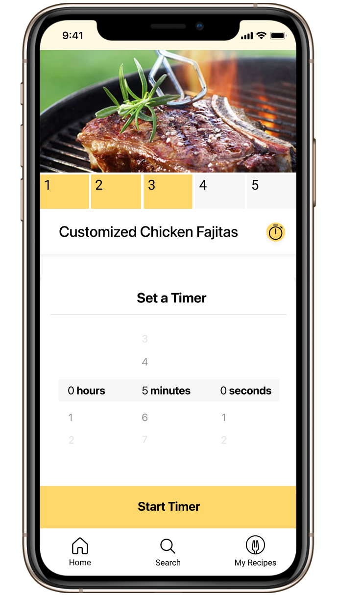
In-App Timer
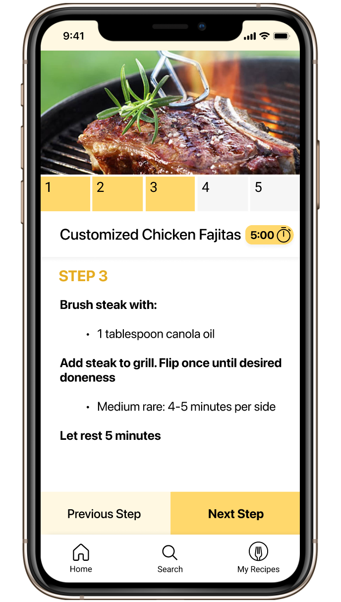
Indication timer has been set

Notification timer is up
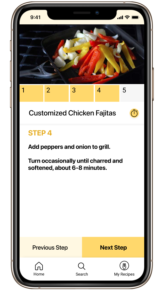
Step 4 of cooking flow

Step 5 of cooking flow
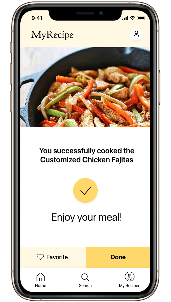
Recipe Completion Screen
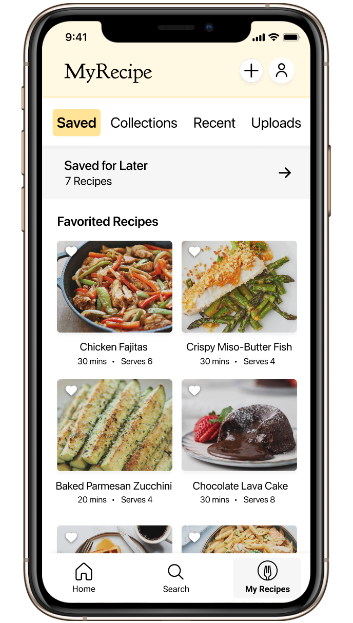
My Recipes Screen
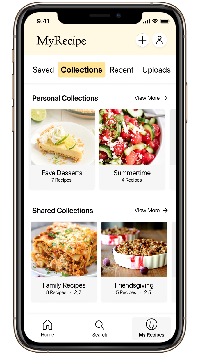
Collections tab of My Recipes Screen
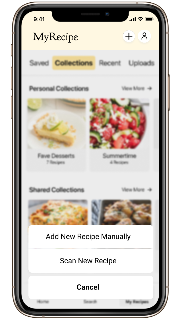
Hit plus button in upper right to add new recipe
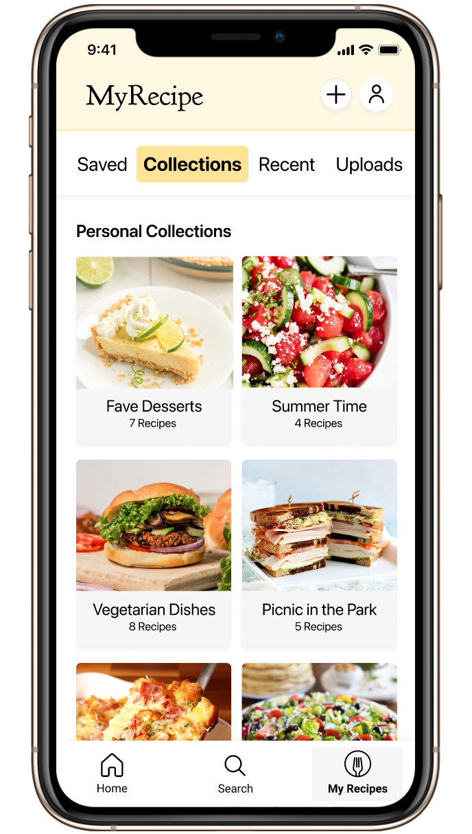
Personal Collections Screen

Shared Collections Screen, where users can collaborate on shared recipe lists
Hi-Fi Usability Testing
We worked with 6 participants, ages 23-63, all of whom have used recipe books, sites, or apps before.
We tested the 3 main tasks of the user flow happy path:
Search for and find a recipe
Customize the serving size and ingredients of the recipe
Complete the recipe cooking flow
Fortunately, we received outstanding results:
100% completion rate on all tasks at an average 92% confidence level across all three tasks
Less than 1 error on average for all three task
An average of just 2 minutes and 45 seconds to complete the entire flow
Users gave some outstanding qualitative feedback, too:
Still, we were able to uncover a few pain points that put users in a pickle and make some fixes.
The Prototype
If you would like to click through the prototype, click the button below.
You can also watch a walkthrough of the prototype in the video below.
Next Steps
Our team is excited to continue working on this concept! Based on feedback, there is a real need for it and users would use it long term. These are some of the next steps we’re looking at:
Design an onboarding process
Multiple users gave specific feedback that they felt the app was easy to use, but they needed a second to orient themselves first
To reduce those moments of uncertainty, we want to take that orientation onto an onboarding flow, where users can receive tutorials on the more complex parts of the app so they can get cooking with no further ado!
Add metrics to recipes to provide more context (ratings, views, number of times cooked, etc.)
Explore voice UI to potentially reduce scrolling with messy hands while cooking
Implement interactions and animations to give users positive feedback and add delight
We’re also taking suggestions on a new name for the app! Let me know if you have any ideas!


