Salt Lake Kicks

Salt Lake Kicks eCommerce Redesign
The Challenge:
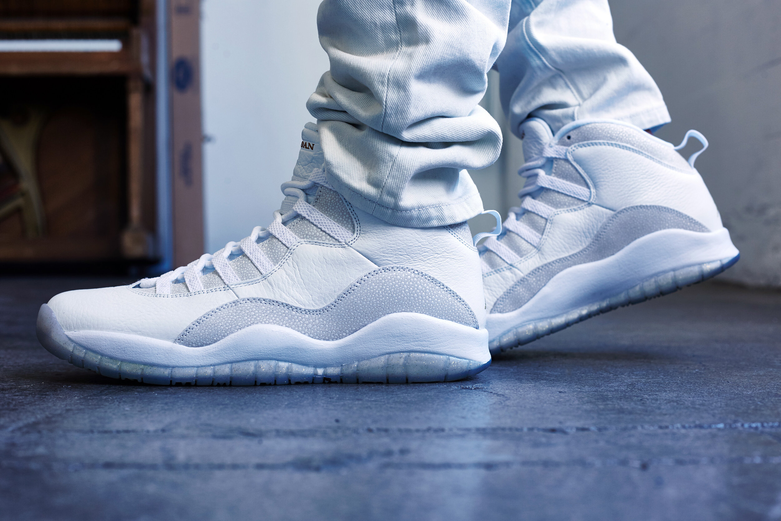
Salt Lake Kicks, a local sneaker reseller in Salt Lake City, Utah, was forced to move operations online due to COVID-19. The site clearly conveyed the passion of the store owner (a teenager named Cole), but needed a fair bit of work to make it more user friendly and competitive.
The Summary:
I launched a two-week sprint to conduct user research, redesign the navigation, create new information architecture, and design and test the brand-new UI for Salt Lake Kicks to increase traffic and allow it to better compete with direct and indirect ecommerce sites.
The Team & My Role:
Team of one; Lead UX Researcher, Lead UX Designer, Lead UI Designer
The Timeframe:
Two-week sprint
The Tools:
Figma, Mural, Miro, Trello (card sorting), Google Sheets
The Process:
The “Double-Diamond” Methodology — Discover, Define, Design, Deliver
Contextual Inquiry, User Interviews, Card Sorting/IA Redesign, C&C Analysis, User Personas, User Flow Design, Sketching, Mid-to-High-Fi Frames, Usability Testing, Prototyping

Homepage before

Product landing page before
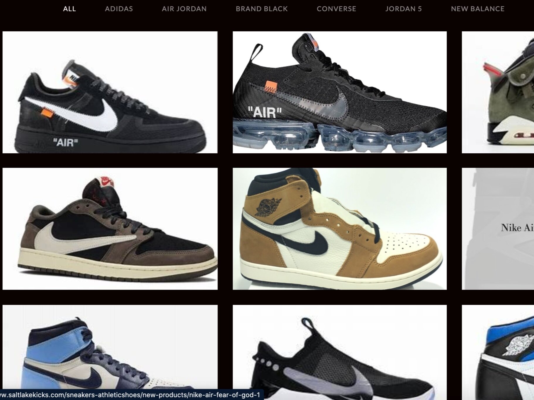
Product gallery page before

Homepage after

Product landing page after

Product gallery page after
Initial Usability Test
Due to the issues in the existing site, some of which are seen above, I conducted a contextual inquiry with a few colleagues to see what features needed fixing, adding, or omitting.
The main issues I discovered were:
• The site looked fake and untrustworthy
• The site logo was massive and persistent on every page
• The global and local navigation was chaotic
• There was no cart for users to check out through

User Interviews
I interviewed 4 interviewees, all males in their late 20s.
Main takeaways:
“I find shoes I’m interested in through social media and other sneaker sites.”
“I find it very important that a site looks and is reputable.”
“I often leave sites with items to come back to later.”
These interview answers were used to drive the ‘Wishlist’ feature and the prominence of social media on the top of the website, and gave the first clue as to who the primary user of this website would be.
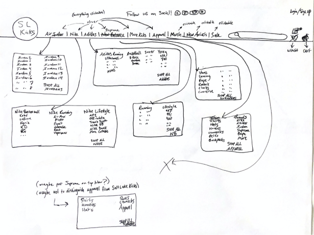
Information Architecture
The entire inventory of the existing site was put into an open card sort for 4 users to categorize and help define the eventual information architecture of the site. There were two main takeaways from the card sorting that influenced the IA the most:
Each tester sorted the inventory into groups largely based on brands, not item types
Brands, then style of shoe were 1A and 1B in card sorting (as well as user interviews)
It was important that the global and local navigation were in lockstep with user interviews and card sorts to ensure the most intuitive navigation possible for our most likely users. That is reflected in the sitemap seen here.


Competitive and Comparative Analysis
Multiple users mentioned using online stores like Flight Club, Nike, and Adidas, so I focused my C&C analysis and eventual Information Architecture on sharing design patterns with these sites.
The existing site didn’t have multiple images, a cart, wishlist, or other typical UI components featured on other ecommerce sites. I wanted to put it more in-line with its competitors.
Topps was added as an indirect competitor to try and capture typical collecting sites, which I had already begun to figure out would play a factor in my user persona.
After gathering this research, it was then time to sum everything up into Problem and HMW Statements.
Problem & How Might We Statements
Problem Statement:
Users want a reputable and comprehensive site to easily discover, browse, save, and purchase shoes & apparel they’re interested in.
How Might We Statement:
How might we improve the Salt Lake Kicks platform to enable users to more easily find shoes & apparel they’re interested in and streamline the purchasing process?

James, our primary persona
User research proved to define 2 distinct personas – James, the sneaker collector and Isaac, the casual shopper who buys shoes more for utility.
There was a mix of those two preferences in interviews, but definitely skewed more toward the former. That led to the 2 distinct personas I had to consider throughout the design process.
Meet James & Isaac, our user personas.

Isaac, our secondary persona
User Flow
For now, we’re going to focus on the primary persona, James’ user flow because it takes us through most of the new features of the site. His flow is complex, because he looks through a lot of inventory.
Because James spends so much time looking through inventory and deciding what he wants to buy, I needed to give him options!
In this user flow, he now has the ability to click through top sellers, filter out by brand (among other filters), sort results, add items to his wishlist, and add items to his cart before checking out.

After developing the user flow, it was time to see what this site would look like on paper.
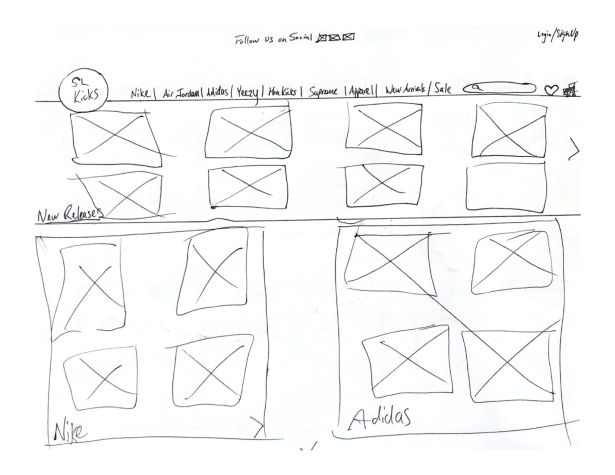
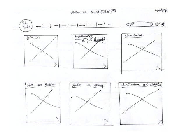


Then it was time to see what this would look like in Figma with some mid-fidelity wireframes.
Due to the large inventory and many pages of the site, I wanted to jump straight into mid-fidelity because I felt it would make for a more seamless transition to high-fidelity.
A sample of some mid-fidelity wireframes:

Color scheme of the new Salt Lake Kicks:
The overall color scheme is black and white to give sleek and stylish look and to make colorful sneakers pop off the screen.
There are, however, some hints of color on CTA buttons as well as the ‘New’ & ‘Sale’ badges inspired by the Great Salt Lake
As I was doing research to develop the color scheme, I learned there is a rail line that cuts through the lake at a certain point. Due to algae growth, the two sides are completely different, vibrant colors of blue-green and purple.
I felt this fascinating detail would bring some character to this website local to Salt Lake City.

The Great Salt Lake Causeway with electric colors on either side of it
High-Fidelity Wireframes

Salt Lake Kicks homepage
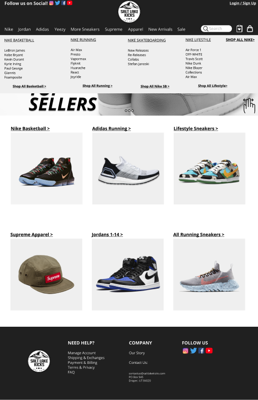
Homepage with hover dropdown menu
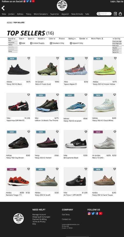
"Top Sellers" screen to direct users to popular products
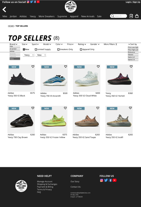
"Top Sellers" screen filtered by Yeezy
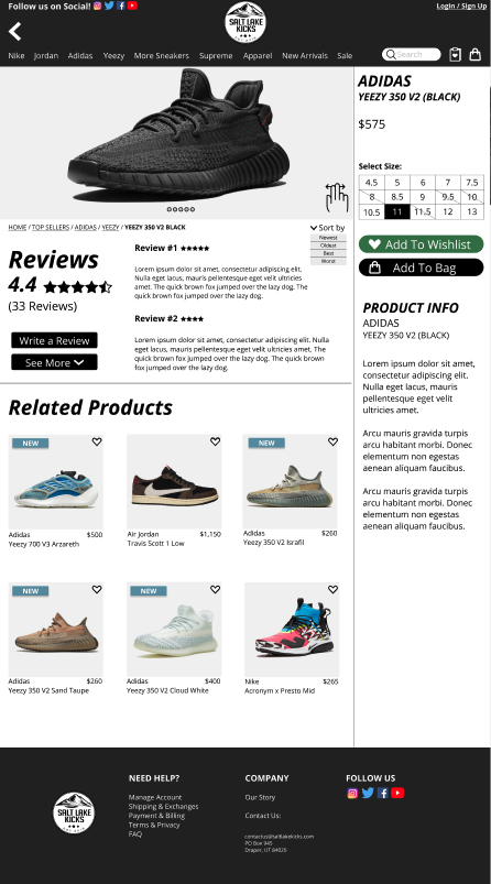
Product landing page
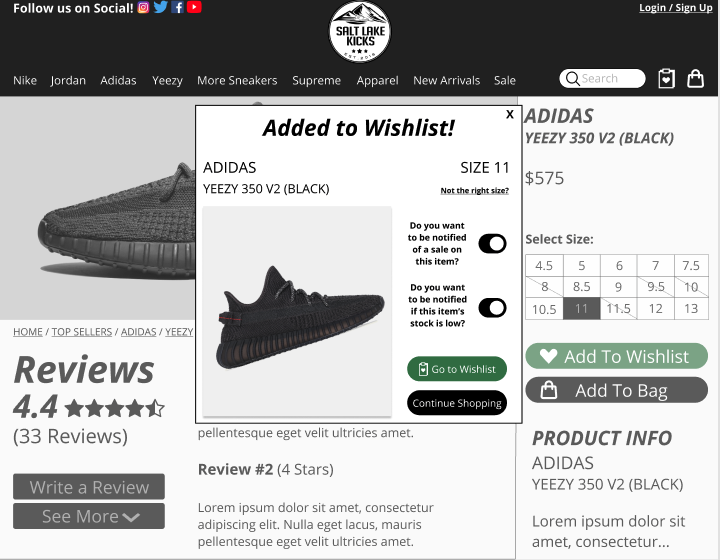
Pop-up card alerting user of wishlist addition
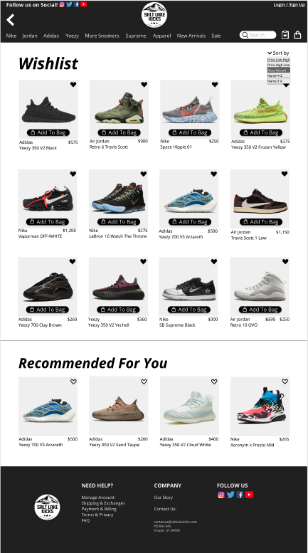
New "Wishlist" screen

Cart screen

Checkout process
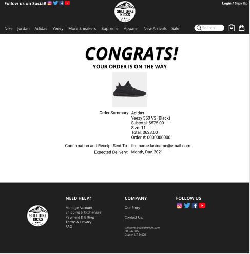
Purchase confirmation screen
Usability Testing
4 users
3 main tasks
1 “happy path” task
Other related tasks within main task to analyze overall flow of site
I decided to measure this round of usability testing entirely qualitatively
At this stage in the process, I felt it was important to observe everyone’s navigational thinking and to allow them to give as much input as they pleased without me timing it
This was a complex prototype with many moving parts yet limited functionality, so I didn’t want to consider any missteps as errors, as it simply meant the functionality of certain features need to be built out (i.e. mini hearts, navigation menu, image scrolling navigation)
I was heartened by the overall feedback and test results, as users flowed through the already-functional features and “happy path” rather smoothly, but was happy to catch a few things that were able to be improved upon
Usability test script I crafted


After usability testing, multiple changes were made. The UX writing was refined, certain functionality was built out further, and the visual design was improved.
The Final Prototype
If you would like to click through the prototype, click here. If you would like to watch a walkthrough of the prototype, please see below.
Next Steps
Continue to iterate based on usability test results
Build out remaining functionality of the site
Stay on top of design trends in this space for future iterations
Conduct a second round of usability testing to gain more insights
Make this the best sneaker site West of the Mississippi
The Takeaways
Hard work pays off. I’m extremely proud of the effort I put in to reimagine and redesign this site. And to help a teenage entrepreneur, too! It’s very gratifying to see that work come to life when you finally reach the point of building a clickable prototype and see it usability tested. This project was undertaken in just week 3 of my time at General Assembly, and I surprised myself with how well I was able to apply what I had learned to that point.
I also want to give a shoutout to user personas for being a thing. My primary persona, James, and the research done to create him, completely drove my entire design process. There is not a single feature on the new Salt Lake Kicks website that does not have James’ imprint on it. Thanks, James!